Many people are very excited by tonight's Oscar award ceremony. My opinion of Oscar award got lower every year and when they failed to even nominate a watershed performance by Kristin Scott Thomas in Il y a longtemps que je t'aime (I've Loved You So Long), I stopped to value it at all. However, I cannot avoid hearing of it. And again, it snubbed another good performance in a language other than English or American, Noomi Rapace in The Girl with the Dragon Tattoo. In regardless if the books are hyped or not, it is undeniable that Ms. Rapace gave an outstanding performance and received no recognition by Oscar. As in the case of Kristin Scott Thomas, she received British Film Award nomination for best actress as well. Of course, there are always exceptions. This year, Oscar did nominated a performance in a Spanish language film - that of Javier Bardem in Buitiful.
It seems that America has an aversion to cultural products made in language other than English. To read a subtitle? God forbidden. No wonder Hollywood once again planned a remake. It is almost inevitable. In an Guardian article, The Girl with the Dragon Tattoo director lashes out at US remake, "The director of the original Swedish version of The Girl with the Dragon Tattoo has questioned the need for the upcoming American remake, reigniting a long-running war of words over Hollywood raiding foreign language films to repackage them for a global audience." Director Niels Arden Oplev says no one can compete with Swedish actor Noomi Rapace's Lisbeth Salander. The article continued: "But however critically garlanded a film is, if an English-speaking audience has to read subtitles, it will automatically reduce the film's chances at the box office, and confine it to the status of art film, whatever its content." It is very depressing.
There have been a rash of remakes, not only in subtitled movie or television shows. There are two very well received, rather recent British TV shows - The Office and Skins, and both were subjected to American remakes. What are the compelling reasons behind these? The British accents are not hard to understand and no subtitles need to read here. The obvious reasons to me are to tone down caustic satires and social commentaries which made American audience uncomfortable.
Dumbing them down.
It also shows that how depleted Hollywood is. It is a place devoid of ideas.
When I grew up in China, all the foreign films were dubbed, instead of subtitled, and innocent Chinese audience had the notion that foreigners spoke in a stylized, glamorous way which turned out to be untrue. People in all the part of the world speak in rather natural ways not dissimilar to those by the Chinese. Nowadays, Chinese people watch foreign language movies with subtitles, due to the increased literacy rate. Subtitled actually are preferred amongst many because they are less censured. Perhaps, Hollywood is preparing us for a very low literacy rate, which is not unlikely, considering our governments of all levels are slicing educational funding as in slicer movies on steroids.
I'm not trying to say not all the remakes are not warranted. Some classics can and perhaps could use a fresh look and re-thinking, like True Grit by the Coen brothers.
I also would love to see Cate Blanchett or Kristin Scott Thomas as Blanche du Bois. But who can match the irresistible mixture of unbridled sex appeal and animal danger of Marlo Brando amongst today's leading men? None. Therefore, let's not have that remake of A Streetcar Named Desire yet.
I have always been fascinated by one art form depicting another. If it involves creating, then it would be even better. A case in study is the book The Girl with Pearl Earrings.
The most challenging case would be trying to depict visuals with music notes. I have been meditated on this theme for a long time and today's San Francisco Chronicle review of San Francisco Symphony's performance propelled me to finish this draft. The review, S.F. Symphony review: A superb 'Rothko Chapel', stated that:
In Davies Symphony Hall on Wednesday night, Michael Tilson Thomas introduced "Rothko Chapel," one of Feldman's richest and most haunting works, to the San Francisco Symphony repertoire. The piece is a virtuoso display of minimalist lyricism, and the few performers onstage gave it a mesmerizing performance.
Written in 1971 for the opening of the interfaith chapel in Houston built around Mark Rothko's paintings, "Rothko Chapel" marks a confluence of several strains in Feldman's work. As ever, the rhetoric is subdued, the tempos slow, the textures sparse and suggestive, and the instrumentation - for solo viola, chorus, percussion and celesta - is a determinative feature of the piece.
But there are other elements in play as well that tie the music directly to its setting. The viola, which is clearly a protagonist and emotional stand-in for the composer, relocates physically to different parts of the stage, adding a spatial dimension to the music.
"Rothko Chapel" is also more explicitly sectional than many of Feldman's works, conjuring up an image of Rothko's paintings being looked at one by one (shades of Mussorgsky's "Pictures at an Exhibition"). And Feldman's writing - particularly the gentle block chords sung by the chorus, which Thomas aptly likened to a cross between Webern and Duke Ellington - is a correlative in sound to Rothko's fields of color, with their solid centers and vaporous edges.
It must be a wonderful evening - I wish was there.
In last couple month's, I've been listening to a recording including Respighi - Gli Uccelli/Il Tramonto/Trittico Botticelliano. Trittico Botticelliano is a three-part orchestral suite, based on the impression from Botticelli's three incomparable masterpieces - La Primavera (Spring), L'adorazione dei Magi, and La Nascità di Venere (The Birth of Venus), all reside in Uffizi Museum.
This suite was conceived by Ottorino Respighi in 1927, during his trip to Washington, D.C. The music was not very photo-realistic and the title helped to set the mood and the way to understand it, quite similar to the better-known Pictures at an Exhibition by Modest Mussorgsky, and unlike some quite vivid poems like La mer by Claude Debussy, which would be hard to miss the topic as the sea.
Back to Respighi. Apparently, he tried to imitate or suggest some old music idiom, as far back as Renaissance period, and the echoing of Vivaldi was palpable. As for the middle piece, a section based on hymn helped to establish the character. However, the overall effect was much established by the suggestions of melody and rhythm, which can be seen as parallel to the paintings the music notes were trying to depict. However, a knowledge of these paintings would be extremely helpful for the listeners to make connections of the aural impact and visual memories. It might be very interesting to listen to these pieces with copies of the paintings in front me, but I haven't tried yet. Perhaps I ought to.
The above-mentioned Pictures at an Exhibition is another good example. However, the artworks Mussorgsky based on are lost to us and I have to admit that I have more difficulty in understanding this than that by Respighi. Therefore, I'll rely more on Wikipedia:
It was probably in 1870 that Mussorgsky met artist and architect Viktor Hartmann. Both men were devoted to the cause of an intrinsically Russian art and quickly became friends. Their meeting was likely arranged by the influential critic Vladimir Stasov who followed both of their careers with interest.
Hartmann died from an aneurysm in 1873. The sudden loss of the artist, aged only 39, shook Mussorgsky along with others in Russia's art world. Stasov helped organize an exhibition of over 400 Hartmann works in the Academy of Fine Arts in Saint Petersburg, Russia in February and March 1874. Mussorgsky lent works from his personal collection to the exhibit and viewed the show in person. Fired by the experience, he composed Pictures at an Exhibition in six weeks. The music depicts an imaginary tour of an art collection. Titles of individual movements allude to works by Hartmann; Mussorgsky used Hartmann as a working title during the work's composition. He described the experience to Stasov in June 1874: "Hartmann is seething as Boris was. Sounds and ideas float in the air and my scribbling can hardly keep pace with them."
Mussorgsky based his musical material on drawings and watercolours by Hartmann produced mostly during the artist's travels abroad. Locales include Poland, France and Italy; the final movement depicts an architectural design for the capital city of Ukraine. Today most of the pictures from the Hartmann exhibit are lost, making it impossible to be sure in many cases which Hartmann works Mussorgsky had in mind.
Mussorgsky links the suite's movements in a way that depicts the viewer's own progress through the exhibition. Two "Promenade" movements stand as portals to the suite's main sections. Their regular pace and irregular meter depicts the act of walking. Three untitled interludes present shorter statements of this theme, varying the mood, colour and key in each to suggest reflection on a work just seen or anticipation of a new work glimpsed.
More broadly speaking, his Night on Bald Mountain and Debussy's La mer can be called musical landscape paintings. Several tone poems by Richard Strauss and Jean Sibelius fall into this category too. I love Sibelius' tone poems greatly, particularly his The Swan of Tuonela. I admire Strauss greatly, particularly his songs and opera, but have to cringe a bit of the banality in his tone poems, such as however masterful they are. Such as Ein Heldenleben (A Hero's Life), Op. 40 (1899) and Eine Alpensinfonie (An Alpine Symphony), Op. 64 (1915). But then, he redeemed himself with his sublime Tod und Verklärung (Death and Transfiguration), Op. 24 (1888-89).
Even more broadly, one can say that some music pieces are portraits as well. The best known example of this is Ludwig van Beethoven's Symphony No. 3 in E flat major (Op. 55), also known as the Eroica (Italian for "heroic"), which was a dedication and semi-official biography and portrait of Napoleon Bonaparte.
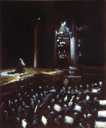
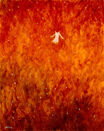
The challenge and admiration between painters and musicians are often mutual and the traffic goes both directions. Even I attempted to capture some music making with my paint brush:
However, my viewing of Finding Nemo left me a very unpleasant feeling, mostly triggered by the characterization of Dory, who was obviously cast as a Wal-Mart shopper. I also found some jokes quite forced.
It seems that humorous or funny moments are prerequisite in animated films nowadays. I have heard people talked about how funny Toy Story 3 is. However, after Findng Nemo, I will stay away from those humors.
Even for movies made for children, it is not necessarily to have these moments. Insisting having them, movie makers fall into mannerism. Children can be trained to be sophisticate and appreciate a good story told straightforward.
I remember that I attended a forum when I was in fourth or fifth grade and gave the visiting local children theater people a lecture on the sophistication of children. I told them that we didn't not need to be cued to laugh or cry. Caricaturization would be all right if it was a farce. Otherwise, we children could appreciate real characterization and good storyline just fine.
I might be too harsh to them but I still believe that adults tend to patronize children and forgot how smart we were when we were little and how annoying it was when we were treated as idiots.
Perhaps, time changed. Perhaps, Chinese and American children are different. "A sense of humor" is an accolade in the US but suspicious in China.
Last weekend, San Francisco Chronicle reported Website lets customers do the designing: "The website is www.zazzle.com and For just over five years, San Francisco's Zazzle.com has operated a website that lets users customize and design their own T-shirts, postage stamps and mugs. It has expanded its product line to include hats, cards, binders, shoes and even iPhone cases..." It seems a good place for artists to utilize their talents and hopefully to generate complementary or main income.
I was quite intrigued, especially because I just had a discussion on fantastic fabric designs made by a linguist friend who utilized her research on medieval life. A typical of her design was based on a drawing by a young boy in 13th century Russia.
I decided to give it a try by using my paintings, drawings, and particularly my photographs to design some cases for iPhone, iPad, T-shirts, mugs, and shoes, etc. I can even upload large images and produce fine quality prints for my self or for my patrons.
Had an interesting discussion with a colleague recently and he mentioned how movies and television shows used tattoos to identify villains, particularly in those with detective themes.
This reminded me that in the 1980s, Chinese movies often utilize a plaster statue of Venus de Milo (Aphrodite of Milos) as a cue to identify elements or characters considered decadent, subversive and counterrevolutionary, most often in spy and political themed movies. Coffee was such symbol as well.
1980s was a time when "Chinese Taliban" ruled streets and they shaved off peoples' hair, cut open people's trousers, if they deemed the hairdo was too outrageous, the pants were too narrow or too wide. Anything immodest was not acceptable.
Though sometimes, stereotype does point at a common trend, often, it is simply stereotype. Nothing more.
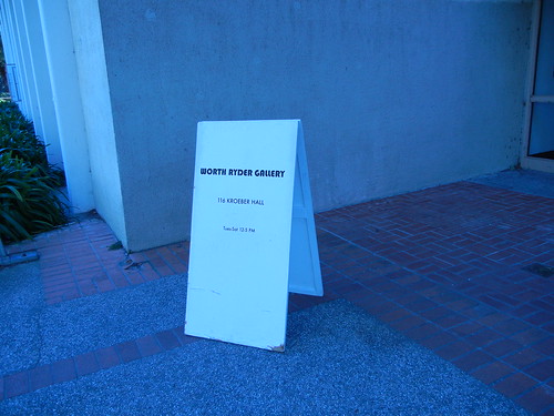
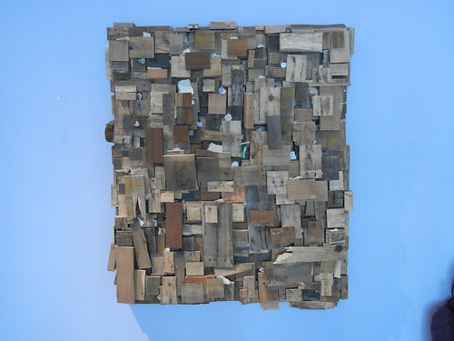
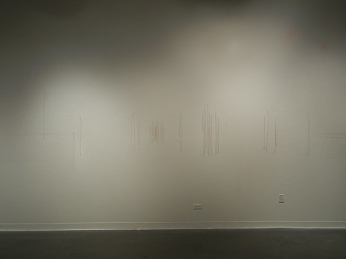
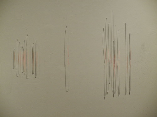
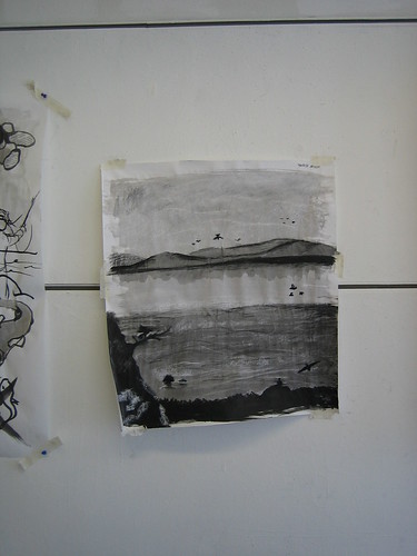
I walked by the Worth Ryder Gallery of Art Practice Department at University of California, Berkeley recently and saw several interesting installations:
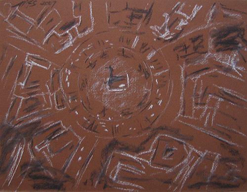
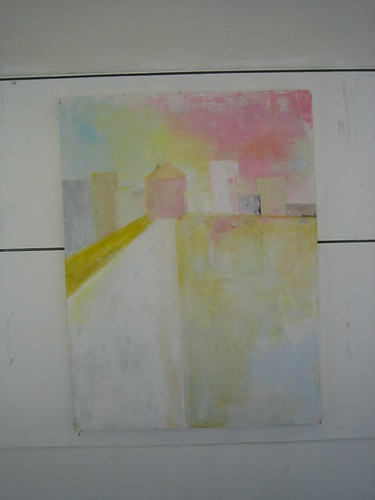
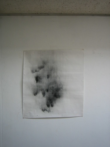
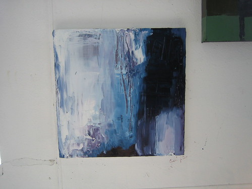
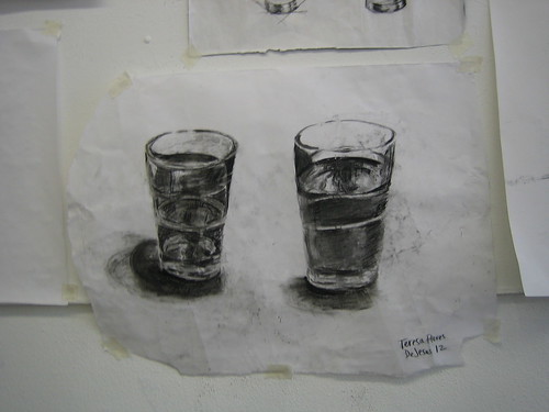
Searching my photo archives and I found several interesting photos I took in the hallways of the Art Practice Department in 2008. They are quite amazing:
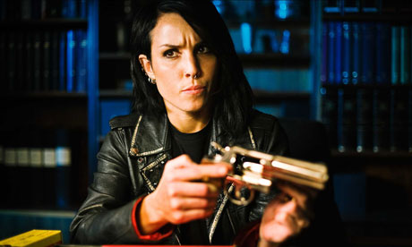 It seems that America has an aversion to cultural products made in language other than English. To read a subtitle? God forbidden. No wonder Hollywood once again planned a remake. It is almost inevitable. In an Guardian article, The Girl with the Dragon Tattoo director lashes out at US remake, "The director of the original Swedish version of The Girl with the Dragon Tattoo has questioned the need for the upcoming American remake, reigniting a long-running war of words over Hollywood raiding foreign language films to repackage them for a global audience." Director Niels Arden Oplev says no one can compete with Swedish actor Noomi Rapace's Lisbeth Salander. The article continued: "But however critically garlanded a film is, if an English-speaking audience has to read subtitles, it will automatically reduce the film's chances at the box office, and confine it to the status of art film, whatever its content." It is very depressing.





 Posts
Posts


