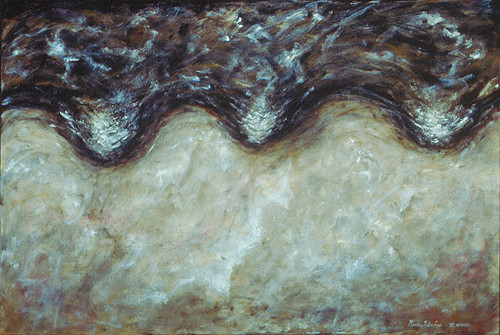
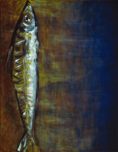
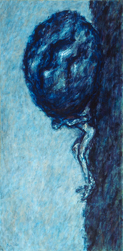
More presentational works is not immune from this problem, though definitely less frequently. Sometimes, such uncertainty or ambiguity regarding the orientation of artworks opens a new dimension and add new meanings to a work.
The orientations of most of my paintings can be determined readily but a handful can be less rigid, such as below paintings, perhaps, one can argue that hanging them upside-down would be just the same:


Perhaps.
I also remembered two occasions when I debated seriously on if those two works should be viewed in horizontal or vertical format.

or

To give my readers a clearer idea, I made the little video below to demonstrate my argument visually:
>> Video presentations of paintings and drawings, Part XIII: Video Presentation of Still Life Paintings
<< Video presentations of paintings and drawings, Part XI: 2011 Calendars Ready for Downloading


No comments:
Post a Comment