Showing posts with label UK. Show all posts

Sunday, September 9, 2012

My Favorite Paintings in the Fitzwilliam Museum, Cambridge, UK

The Fitzwilliam Museum in Cambridge was the last major museum I visited in the United Kingdom in 2006.  It was founded in 1816 and is the art and antiquities museum of the University of Cambridge. Naturally, an institution as ancient as this would have amazing collections and my expectation was fully met.

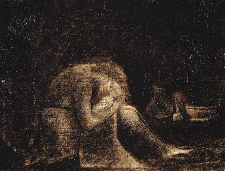
Yet, amongst its endless arrays of antiquities from all corners of the world, and paintings by many great masters, I was most affected by a very small monochromatic painting, titled Agnes (below), painted by an artist named I didn't know - Catherine Blake.


Agnes, tempera on canvas, circa 1800, height: 14 cm, width: 15.3 cm
Catherine Blake, British, 1762-1831 

Online search yielded that Catherine Blake was indeed related to the more famous Blake, William.  Wikipedia informed us that "Catherine Blake (née Catherine Boucher) (1762–1831) was the wife of the poet, painter and engraver William Blake (1757–1827), and a vital presence and assistant throughout his life as an artist.

What moved me most by that painting was that it was incredibly sincere, touching, a bit scary and immensely beautiful, despite its obvious gloom.  It was done with tempera but looked more like an etching or a drawing; I have no argument with this fact, because my paintings are often monochromatic and I truly appreciate its dark psyche and the draftsmanship undisguised by display of colors.

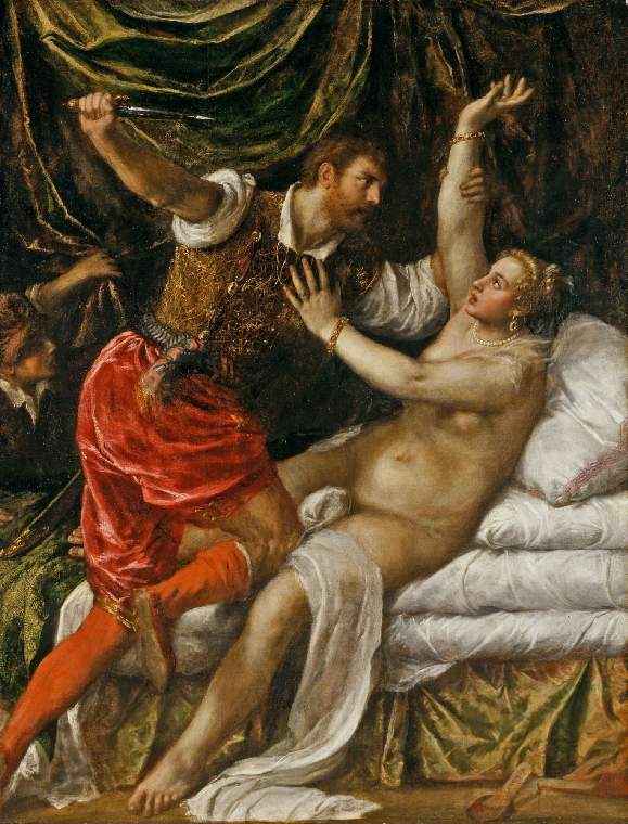
To cure the melancholy this painting plunged me into, I turned to the colorist Venetian master Titian for a cure.  Well, it was a painting about a tragic affair, but it was so stylized and so beautiful to behold, that one ought to be forgiven to feel joyous in front of this enchanting painting, a painting with graceful figures, lovely nude, ravishing colors and wonderful composition. 


Tarquin and Lucretia, oil on canvas,  circa 1571, height: (canvas): 188.9 cm, width: (canvas): 145.1 cm
Tiziano Vecellio (Titian) (1488/1490-1576

The horror Lucretia suffered, actually, got heightened once viewers looked pass the surface beauty and dived deep into the situation the master depicted, and that made this painting, beyond its beauty, profound.


My Favorite Museum Collection Series

>> My Favorite Museum Collection Series 50: My Favorite Paintings at Rijksmuseum, Amsterdam
<< My Favorite Museum Collection Series 48: My Favorite Paintings at Tate Britain, London


List of My Favorite Artworks in the Museums I've Visited

Monday, August 20, 2012

My Favorite Paintings in the Courtauld Gallery at Somerset House, London

London's museum and galleries are astonishingly rich, way beyond the most prominent the British Museum and the National Gallery.  The somewhat lesser known gallery, the Courtauld Gallery at Somerset House, London, had a rich collections of Renaissance, Baroque, Impressionism, Post-Impressionism and 20th Century works, many of them iconic.

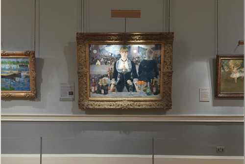
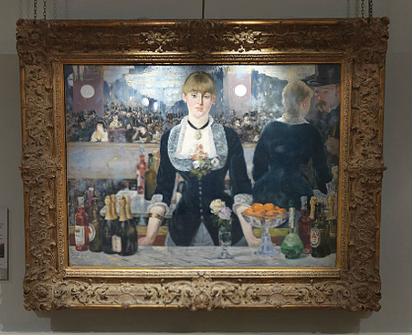
My favorite paintings there were seminal ones - one was A Bar at the Folies-Bergère, 1881-2, by Edouard Manet, and was dated as 1882; and the other one was a striking triptych by Peter Paul Rubens, The Visitation (left panel), The Descent from the Cross (center panel), and The Presentation in the Temple (right panel).  The former one was intimate and still and the other public and dramatic. 

A Bar at the Folies-Bergère, 1881-2, Edouard Manet, The Courtauld Gallery, London - 500
A Bar at the Folies-Bergère, 1881-2, Manet, Edouard, Date 1882

A Bar at the Folies-Bergère, 1881-2, Edouard Manet, The Courtauld Gallery, London

Amongst the artists often grouped together as Impressionists, I am very partial to Manet.  I appreciate him very much because he was not merely chasing a certain detached natural effects, rather, he dived deep into human psyche and that meant much more for me.  I also love the way he handled dark colors, particularly that of black, which was a true color under his brushes, instead of devoid of color in a minor hands.  His characters, elegant, lovely, but often a bit detached and melancholic, a forerunner of Edward Hopper.

In this lovely painting, in the Folies-Bergère, Paris's first music hall, had a notorious reputation as a place for men to pick up prostitutes.  One could see that the barmaid, resigned herself to the scrutinizing gazes from patrons, who we could see on the large mirror behind the pensive barmaid.  Manet also presented the back of her, through some optical trickery, and the customer she was serving.  She slim figure, tightly laced up, presented her like one of the wine bottles being offered to the patrons.  She was there, but also far away.  That absence drew us in, so did the impossible relationship between she and the mirror reflecting her back.  It perhaps was not scientifically accurate, but it gained much more through such "imperfection".


Triptych, 1611-1613, Oil on panel, Peter Paul Rubens
The Visitation (left panel), Height: 83.2 cm; Width: 30.3 cm
The Descent from the Cross (center panel), Height: 115.2 cm; Width: 76.2 cm
The Presentation in the Temple (right panel), Oil on panel Height: 83 cm; Width: 30.4 cm

The triptych above by Rubens was startlingly spectacular and emotionally charged, verged on hysteria.  The paintings were resolutely catholic and was saved from being vulgar and sentimental by the master's somber coloration and the restrain from the side panels, particularly the Visitation, which was almost charming, if one overlooked the looming storm in the background and the scarlet robe Mary wore. 


Triptych: The Visitation (left panel) and The Presentation in the Temple (right panel)

The crowning achievement of this triptych was the amazing grouping of the central characters - each had their very individual way of coping with the tragic event and the glistering twisted body of Jesus was powerful and godlike, even in its death agony.  Its weight, sliding down from the shroud, demonstrated vividly by the supporting John, whose back-bending body added intensity to the drama and his scarlet robe echoed that of Mary's in the Visitation.  Mary herself, mirrored herself in the Presentation almost in the same pose and same robe, though much softer and more worn, with much less brilliance in its color, a mother in deep sorrow, in contrast to the mother of the new born. 


Triptych: The Descent from the Cross (center panel)


My Favorite Museum Collection Series

>> My Favorite Museum Collection Series 47: My Favorite Paintings at Tate Modern Gallery in London
<< My Favorite Museum Collection Series 45: My Favorite Paintings at the Wallace Collection, London


List of My Favorite Artworks in the Museums I've Visited

Saturday, August 4, 2012

My Favorite Paintings in the National Gallery, London

In 2004, I visited several art capitals in the western Europe - London, Amsterdam, Den Haag (The Hague), Rotterdam, Brugge (Bruges), and Antwerpen (Antwerp).

The great London was rich with art collections and looking back now, I marvel at the stamina and my strategic planning so essential for so many museum and gallery visits in mere three weeks, considering I wasn't there for visual art alone.  I also saw three plays in London, visited Stonehenge and wonderful Roman ruin in the Georgian city of Bath.  The more I think about it, the more I am grateful for my good fortune of having enjoyed so many visual feasts.

The most impressive painting museum in London was the National Gallery - the British Museum was more impressive in its antiquity collections.  In the National Gallery, there were much to savor and the two paintings left me the strongest impressions were a simple portrait by Giovanni Bellini and a double portrait by Jan van Eyck.

The portrait of Leonardo Loredan presented the Venetian Doge in full official regalia - lavishly yet subtly embroidered state robe and a horn-shaped hat, 'corno', which was worn over a linen cap.  The distinctive official costumes of those Venetian doges were wonderfully picturesque, as also described in my previous entry, My Favorite Paintings from Museum of Fine Arts (Budapest), while discussing a Titian's portrait of another Venetian Doge Marcantonio Trevisani, done about half-century later.  In both paintings, these fanciful costumes avoided being comical largely due to the gravitas of those severe-looking Doges themselves.


Doge Leonardo Loredan, 1501-2, Giovanni Bellini 
Source: wikipedia
Public Domain

Bellini's Doge, in contrast to Titian's glowing yellow, dressed in silvery robe and looked much cooler and more metallic, but no less sumptuous.  He was as sharply profiled, wearing a similar hawkish determined expression.  He looked somewhat younger, due to the cleanly shaved chin, and without the later Doge's sadness and apparent compassion.  Bellini's Doge was more meditative, still and pensive, deeply in his own thoughts, private but not secretive and one felt no need to fear for this magnificent prince.  As a matter of fact, Bellini made him quite rigid and stiff in the armor like robe, resembled a puppet doll.  Was that the true status of that particular Doge? 

This work was painted in the style of sculpture busts popular at the time. Bellini, famous for his portraits, helped advance this art form in Venice.  Despite the sculptural inspiration and rigid facial and wardrobe structures, this Doge was also fully human, thanks to the detailed depiction by the marvelous painter.  Every detail was perfectly defined, from the tiny highlights in his eyes, to the fine threads on the embroidered silky robe.  And thanks to the painter's keen observation and his ability to reveal a hidden humanity of the sitter, who was under obvious strict social constraints.  The painting was very pleasing to viewer's eyes with its contrasting yet harmonious palettes - warm yellow glow of the figure and cooler but rich looking blue/green flat background.  It was an unforgettable piece of art.  A bit mannered, or simply stylish, one could argue.

If the Bellini's sitter looked a bit strange, the below masterpiece by Jan van Eyck was like a study of strangeness or hallucination albeit a beautiful and delicate one.

The portrait of Giovanni di Nicolao Arnolfini and his wife, an "official" double portrait of the couple, was not a wedding portrait, as often assumed.  It was simply the record of their prosperous and faithful married life. With their very pleasing doll-like or elvish figures, alabaster skin tone and expressionless faces and impossible anatomy and proportions, they were an enigmatic couple and very endearing.

Arnolfini, a member of a merchant family from Lucca, Italy, lived in Bruges, Belgium, had an obviously materially comfortable life. The couple are shown in a well-appointed interior, in front of a large canopied marriage bed to the right.  In the middle of the painting, above their joined hands, there was a large chandelier and a convex mirror fantastically painted with every possible details, and perhaps more.

In contrary to another common believe, the wife was not pregnant.  She simply held up her full-skirted dress in the contemporary fashion, with her hand resting on her belly, definitely gave it an illusion of a swell.  But she was simply showing off her yards after yards trimmed finery.  This painting was inundated with such visual illusions.
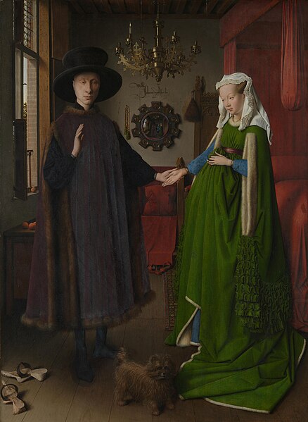

The Arnolfini Portrait, 1434, Jan van Eyck
Source: wikipedia
Public Domain

The painter signed with ornate Latin on the wall, translated as 'Jan van Eyck was here 1434', above the convex mirror.  The mirror reflected the backs of the couple and another two figures in the doorway. One may be the painter himself.  Arnolfini raised his right hand, perhaps as a greeting.

Source: wikipedia
Public Domain
This painting boasted endless wonderful details, almost all of them carried some symbolic meanings, such as the companion dog as a symbol of faithfulness and love, the fruits on the window ledge stood for fertility and the fall from Paradise, and even the discarded slippers signified the sanctity of marriage.

Van Eyck gave us a painting with a luminous and almost reflective surface and many subtle effects of light - direct or diffused, such as the gleaming brass chandelier and the reflection on the mirror.  He achieved this by applying layer after layer of translucent thin glazes. This painting held us in spellbound with the amazingly precise depictions of the array of differentiated textures and surface appearance of so many objects, all with intense glowing colors.

Art historian Craig Harbison pointed out to us that this painting "is the only fifteenth-century Northern panel to survive in which the artist's contemporaries are shown engaged in some sort of action in a contemporary interior. It is indeed tempting to call this the first genre painting - a painting of everyday life - of modern times".

The final footnote to this painting was that after seeing this unforgettable painting of material wealth and opulence, I saw a large print of it in our hotel lobby in Bruges.  Our hotel was called Hotel Lucca, formerly the Lucca warehouse, built originally by none other than the very same Giovanni di Nicolao Arnolfini.

A most delightful coincidence.


My Favorite Museum Collection Series

>> My Favorite Museum Collection Series 43: My Favorite Sculptures from The British Museum
<< My Favorite Museum Collection Series 41: My Favorite Paintings from Museum of Fine Arts (Budapest) (Szépművészeti Múzeum)
List of My Favorite Artworks in the Museums I've Visited

Saturday, January 9, 2010

Official Portrait of Princes William and Harry

San Francisco Chronicle reported that a new official portrait of Princes William and Harry of UK by artist Nicky Philipps was on display at the National Portrait Gallery alongside other royal portraits.

The painting was well-executed - I like its somber tone and the poses between casual and formal and the apparent brotherly connection between the sitters. It recalled me Whistler's Mother. The simplistic frontal lighting did not generate drama, instead it instilled a certain serenity. Perhaps precisely because of these, the painting seems a little dated and lacks a certain edge and energy. Was the artist being ironic? However, the painting does draw viewers in and invites people to ponder. In that sense, it is a success. The golden frame however clashes with the blue sash violently and should be replaced as soon as possible.

An official portrait is always difficult to inject artistic statement, but a successful artist must find inspirations from this constraint. One of my favorite official portrait is "Charles IV and His Family" by Francisco de Goya y Lucientes (see below). The Princes William and Harry is a very good official portrait; I just wish the artist and the sitters would be bolder and have made more excellent decisions.