 Recently, Steve Masover reported on the first survey in the United States of the Swiss-born artist Urs Fischer Exhibit at MOCA, Los Angeles, titled The silliest art I saw in Los Angeles: Urs Fischer at MOCA, and apparently he the banality and pretentiousness of Fischer's world didn't it well with him.
MOCA stated that "Fischer's world is fluctuating and unpredictable, and the pleasure that we derive from his sculpture and painting is based on our attraction to and simultaneous repulsion by the dreamlike appearances that he constructs. Fischer's work is characterized by an unending diversity of materials, strategies, concepts, and images. The artist delights in the possibilities of surface, but even works that suggest his handmade touch turn out to have been produced through a range of digital processes in order to create the oddly surreal appearance of reality gone wrong. A twisted take on the real, Fischer' work unabashedly declares its affiliation to such art historical movements as Pop, Surrealism, and Dada, all of which similarly toyed with the found image to create new and unanticipated combinations, shifts of scale, and a sometimes violent collision of visual information."
For the title of silliest, I'm afraid that Fischer had steep competition in the modern art circus; though I do have to agree with Masover on the silliness of many if not all of the works included in the special exhibit, meanwhile, I also want to point out that some of the images were startling, though not necessarily full of meaningful depth or originality, a characteristics many contemporary artists strive for, usually with no much valid justifications, and occasionally I was bemused and entertained by his whimsical works.
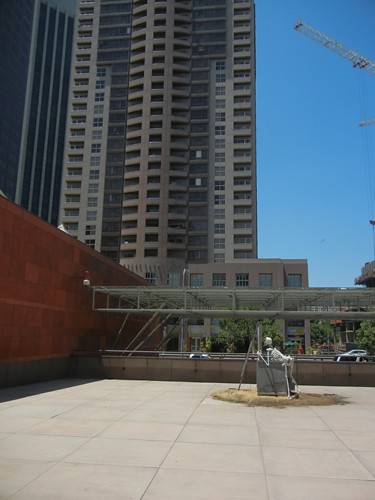
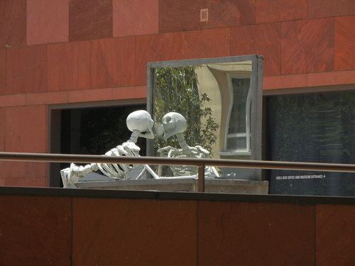
Before entering the museum, we saw one of his installation/sculpture of a skeleton looking into a mirror and such motif repeated presented itself throughout the exhibit. Striking start.
Yet, my sense of adventure was soon replaced by dismay - in the first exhibition hall, many daily object scattered around on the floor, surrounding a spiderweb like a metal bed. Utterly meaningless and it was both offensive and condescending from the artist and curator to tell patrons those were artworks:
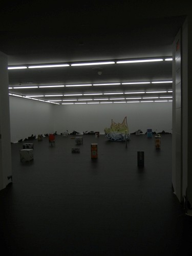
Untitled, 2011 (in the back), Cast aluminum, epoxy primer, polyester filler, one component acrylic putty, urethane primer, polyester paint, and acrylic polyurethane matte clear coat
Next room was a mixed bag. There were some striking images - blue raindrops, brown bread houses, pink crazy dancing lamppost and a big cutout on the cardboard allegedly represent a large raindrop, and then a portrait of a glamorous woman, whose face was covered by a slice of orange or lemon. Striking images yet quite hollow.
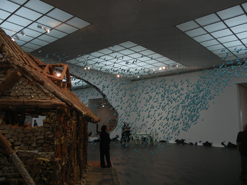
Horses Dream of Hourses, 2004, Plaster, resin paint, steel, and nylon filament

Horses Dream of Hourses, 2004, Plaster, resin paint, steel, and nylon filament, credit: Steve Masover

Horses Dream of Hourses, 2004, Plaster, resin paint, steel, and nylon filament
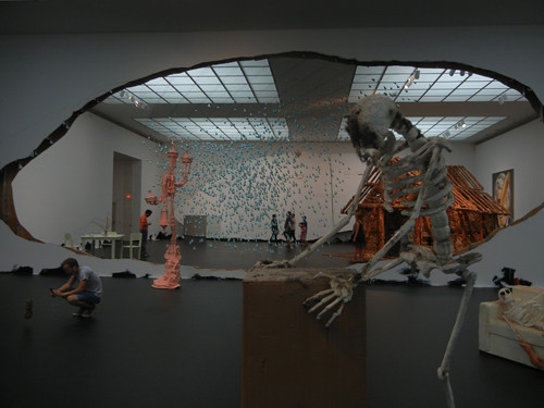
Portrait of a Single Raindrop, 2003, Cuts in wall with relocated cutouts
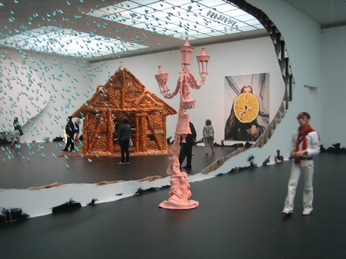
Problem Painting, 2012, (on the back wall)
Those strange and crazy shapes were fun to look at it at first but then once I tried to understand what they mean, and to evaluate their aesthetic and artistic merit, I started to feel indifferent and my resentment for being made to look at with these mannered creations started to mount. If the above images at least awed one with its outrageous scales, the below familiar objects were quite silly and empty, besides the occasional whimsical effects. Quite banal.

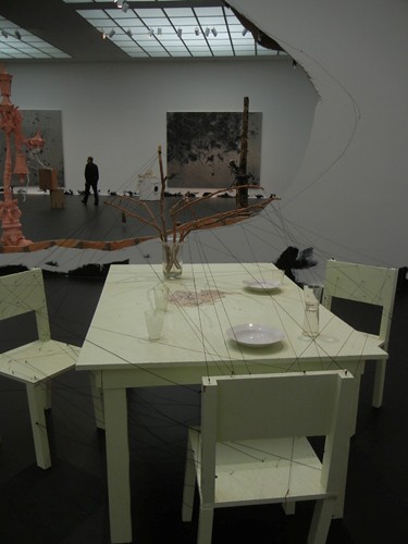
Frozen, 1998, Wood, particleboard, latex paint, enamel paint, candle, vase, dishes, branches, wool yarn, wood glue, nails, and silicone
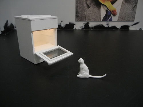
Mr. Flosky, 2001-02, Wood, latex paint, lamp, cable, plaster, polystyrene, glass, glue, and screws
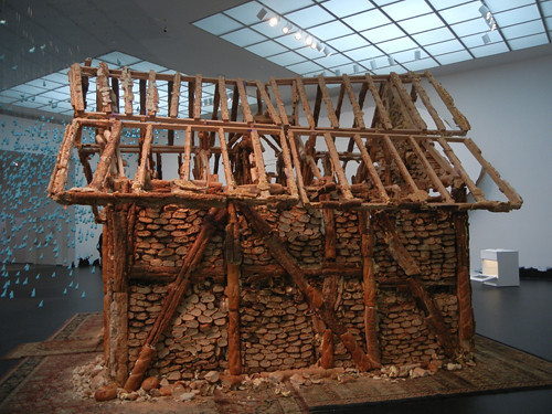
Untitled (Bread House), 2004-05
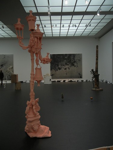
Frozen Piornner, 2009
Even the skeletons in the next room, however tortured, were quite narcissistic and mannered, and again, quite banal. I surely appreciate the feeling of danse macabre, and it evoked memories of eerie paintings by Bosch or Brueghel but then comparison with those old masters demonstrated the paleness and superficiality of Fischer's works. There was little depth and no appreciation of humanity therefore even the horror was superficial and hollow.
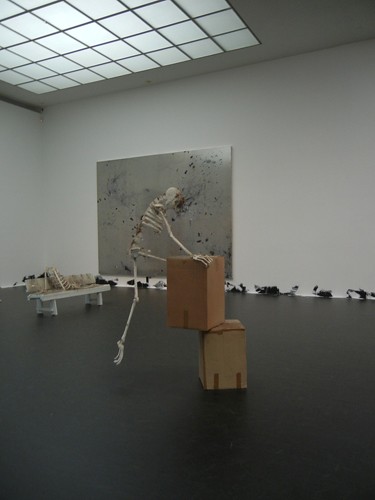
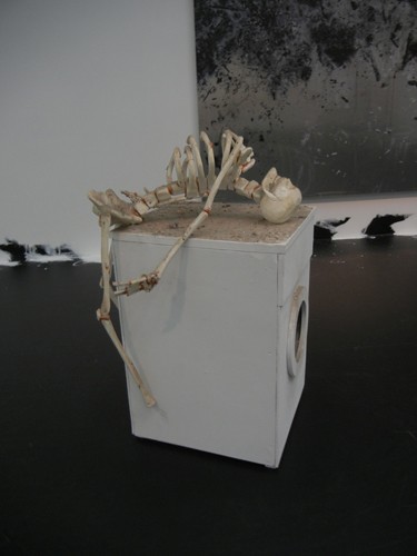
Violent Cappuccino, 2007 (left), One More Carrot Before | Brush My Teeth, 2001 (right)
One work I did like was an abstract painting (below) - it was painted on shining aluminum panel and the black paint was like the fiber of a nightmare, seductive yet dangerous. Perhaps, his true abstract works, without a silly and condescending title, removed from any resemblance to daily objects, enabled me to approach and appreciate it burden free, and move into the realm of my imagination, without being force fed to his brand of interpretation.
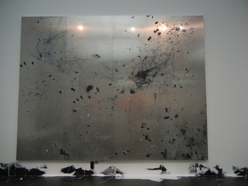
Untitled, 2007 (one of the three panels), Aluminum panels, transparent primer, vinyl paint, pigments, silicone, and screws
For Masover, the work by Urs Fischer he responded well was a 2004 installation we saw not in the special exhibition rather as part of the permanent collection of MOCA - a balloon tied to the end of a mop stick, titled A Place Called Novosibirsk (below). I found it utterly ridiculous and hated it intensely:
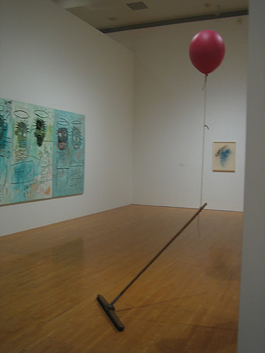
A Place Called Novosibirsk, 2004, credit: Steve Masover
~~~
As Masover, I responded to the big piece, Horses Dream of Horses, with a stirring memory of a favorite artwork of mine in San Francisco's De Young Museum, titled Anti-Mass, by Cornelia Parker. Parker's piece, at first glance, was an intriguing but rather pleasant looking mass, which seemed playful and fun, as well as hypnotic. But, once a viewer understands what the fragments are, the perspective changes instantaneously and the work took on a weight far larger than the collective physical weight of these fragments.
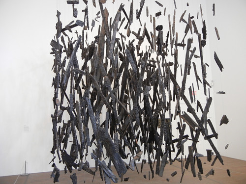
This sculpture was constructed from the charred remains of a Southern Baptist church with a predominantly African American congregation, which was destroyed by arsonists. Her works was not just the intriguing fragments and beautiful assembly rather, it reflected a larger scope of society and history and served as social commentary and that was the essence of great art.
And that was what was missing from Urs Fischer's pieces.
Related posts on Art · 文化 · Kunst:
- LACMA - Los Angeles County Museum of Art
- Revisiting Norton Simon Museum in Pasadena
- Getty Villa in Los Angeles (Malibu)
- My Favorite De Young Museum Collections
- My Favorite Paintings at Akademie der bildenden Künste Wien
- Niobe - An Installation
- Unexpected Successes of "Stringed White Dresses - An Installation"
- Boy With Frog Sculpture and Punta della Dogana, Venice
- Second Thoughts on the Sculpture "The Blind" by Lorado Taft
- Paper Sculpture and Cut Paper Art
- Three Heads, Six Arms (Nezha), Giant Bronze Scuplture at Civic Plaza, San Francisco
Label: Los Angeles, Los Angeles Trip 2013


No comments:
Post a Comment